


Restoring the Fireplace on a Budget
by Food, Wine, and Home


This eyesore had been poorly painted by a previous owner in a Semi-Gloss Red paint. Maybe they were going for a brick look but unfortunately they missed the mark.
They were trying to come up with a solution on a budget
Sarah spent some time browsing home improvement blogs and DIY forums, and finally decided to give faux painting techniques a try. She figured she could fall back on a simple monochromatic look if her art project turned into a misadventure.
Her husband removed the glass doors and found that the surrounding metal cover was full of old insulation (probably asbestos) . They decided to throw away the doors and install some other kind of cover later. In the meantime, she had to do something about the unpainted bits of stone that had been hidden beneath the old cover. She used coarse-grit sandpaper and a scraper to smooth out the edges and remove drips, then applied white primer over the entire fireplace. She likes Zinsser primer the best. It is a good multipurpose primer that is compatible with masonry. (Without primer, porous stone or brick will soak up a huge amount of paint.)

Next she applied a light base color to the whole fireplace. This coat serves two purposes: it creates realistic-looking mortar between the stones, and a consistent base color for the “glaze” colors applied over the top with a sponge. She bought a gallon of Behr “classic taupe” in flat finish — the kind without primer mixed in. (For the record, the Behr “ultra” with primer mixed in is not worth the extra money. It’s thick and hard to use, and still doesn’t cover as well as separate primer + regular paint.) One coat and a few local touch ups of the taupe were all she needed for full coverage. (Note: other light colors like grey could be used as the base color. Pick a color that compliment the rest of the color scheme you choose, and also one that is convincing as mortar.)

Looking at real stones and many fireplace pictures helped her select colors for the glaze coats, which are painted on top of the base color. She wanted a natural, subtly earthy look. She also wanted to complement the oak floor and warm-tone cream walls. With this in mind, she avoided cold-tone blues and greys. She settled on five glaze colors: earthy brown, burnt orange, fossil green, coral pink, and light sandstone. Sample-sized paints were sufficient for this part of the project. I got two colors from the discount “oops” paint section at Home Depot for $0.50 each, and the other three samples for $3 each. I also picked up a multi-textured art sponge and some cheesecloth for about $5.
She channeled my inner 3 year old for this next part of the project. She smeared paint on the stones with the sponge and my fingers, and blended haphazardly with the cheesecloth. She wanted to create the natural color variations, veins, and imperfections that characterize real stone. She applied the darker colors first, careful to use a similar balance of colors on the left and right sides of the fireplace. The goal was to create a general feeling of balance without perfect symmetry. Real stones are never totally identical. When the darker colors were dry, she lightly dabbed the sandstone color over the top of all stones with a sponge to create a calcified, weathered look, using the cheesecloth to remove excess paint.

Later, she used Q-tips to touch up the mortar, and a paint brush to touch up areas of the (freshly painted) wall that she nailed with the sponge. She only used one strip of tape on each side, but that was not enough. It is very hard to control a big puffy sponge that is covered in paint. In retrospect, she recommends generous use of blue painter’s tape and/or butcher paper on the nearby walls.
She painted all the stones and the mantle piece before tackling the big lower ledge. That ledge was the most difficult part of the whole project because of its size. After trying a few different techniques, she realized that she needed large “features” on this stone to make it look real: long veins, large blots of color, and sizable imperfections. A real stone of that size would not look symmetric and perfect.
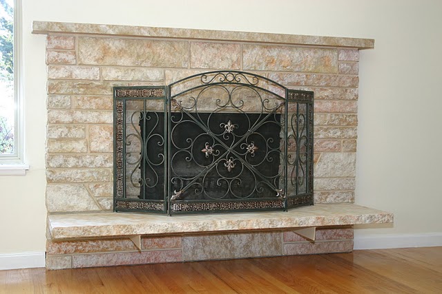
The complete cost of the project $150:
$20 for primer, $30 for base paint, $10 for glaze paints, $5 for a sponge and cheesecloth, and $85 for the screen. (A roll of painter’s tape, drop cloth, paint tray, and a couple brushes would add about $50 of expense if you don’t already have those items.)
Great Job.
Do you have a Home Remodeling Tutorial?
Contact Cheri


{ 3 comments… read them below or add one }
looks awesome! i bet that was a lot of work, but the final product is worth it!
That does look good but I have to admit I sort of liked it red too. Stopping in to follow through a hop – Hope you can stop by soon and return the favor 🙂 http://www.shaunanosler.blogspot.com/
No kidding, great job. I like it so much better.